If you think websites all work the same, we are here to tell you differently! Designing a website and designing a website that works are two very different things. There are four main elements to an effective website design.
1. User Experience
Always design with the user in mind. Think about the questions your personas are asking. Why are people coming to your site? The design should cater to your persona. Think about what needs they have, and what immediate action they're hoping to take when they land on your homepage. Design every aspect of navigation with your users in mind.
For example, if you’re a remodeling construction company and your audience is middle-aged women looking to renovate, then your website should be designed with a feminine approach, as opposed to a rugged construction company website. This is why conducting research on your target audience and personas is so crucial to your website's success.

2. Call-To-Action Buttons
Calls-to-Action (also known as CTAs) are key in website design. Inbound marketing is about taking the next step, as the persona or user is ready. A CTA button is that next step. As a designer, you need to visualize where the user will be looking for more information and place a CTA in that space. Keep in mind that not every button is a CTA, but every CTA is a button.
CTAs help guide the user down the funnel. If they don’t stand out or if they’re not placed properly it can confuse your users and discourage them from clicking through. The most important elements to a CTA are the design, language, and placement. This will ensure the highest conversion rate.
3. Responsive Design

Throughout your design you need to constantly ask yourself, How will this look on mobile? If your design can’t be seen on a mobile device, then you’re doing it wrong. 80 percent of Internet users own a smartphone. This means that when people are looking for garage door repair, oil changes, and an appointment with a chiropractor, they're likely handling it all from the palm of their hand. Responsive website design is crucial.
Keep the 12 column system in mind. This can be intimidating to designers but Bootstrap is a great resource to give you a visual. Bootstrap lets you see how the blocks will shrink down and help you design around that. If you’re making a Call-To-Action or custom image, make sure it’s still legible at 320 pixels wide.
4. Testing & Analysis
ALWAYS test your site. Test and retest, and then test some more. Just because something worked on a previous web design, doesn’t mean it’ll work for this one. If you’re trying something new, test to make sure it works! Don’t be afraid of failure, that’s how you learn. If your first idea didn’t work, try another one. Again, keeping your user in mind, know that if there's an issue with your website, they'll find, experience, and remember it. You can't take that chance. QA your site before launch, and give yourself (and your team) the task of trying to break it. Find the fault lines, and reinforce them.

On our website, we added this device called CrazyEgg. This helps us test our site and shows us how far down page users are scrolling and what they’re clicking on, along with other awesome features. If you notice something isn’t working as well as you’d like, make a change.
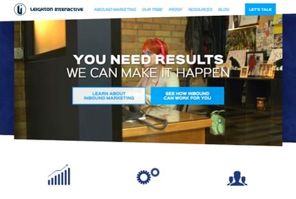
For example, our old website design had a “Let’s Talk” button that wasn’t performing as well as we’d hoped. So what did we do? We tried something else!

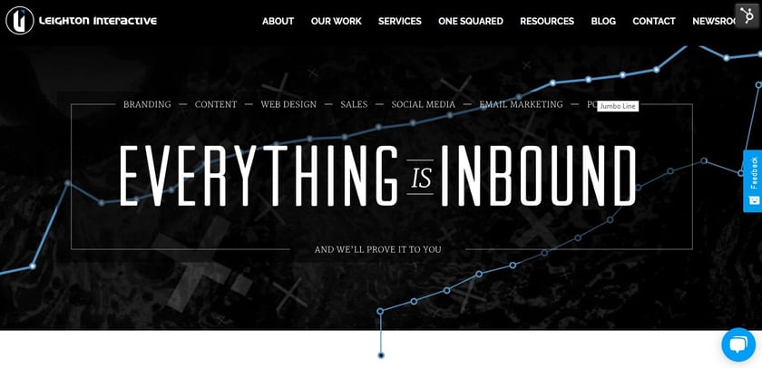
Our current website now has a chatbot to answer questions users are coming to our site for. We’re constantly testing different factors to see if our website can do better than the current design to provide a better return on investment (ROI).
By using these four principles, you can design one beautiful and effective website that'll get the results your business is looking for.
