Where would we be in life without street signs telling us where to go? The same sentiment holds true for CTAs or calls to action across digital platforms like web pages, blogs, emails, and the like.
But what makes a CTA stand out? What makes people want to click it?
If you’re currently pondering these questions, then you’ve come to the right blog. Let’s review the basics of CTAs, what makes them effective, and how to create killer ones in HubSpot.
What are calls to action (CTAs)?
HubSpot defines a CTA or call-to-action as: “...a button or link that you place on your website to drive prospective customers to become leads by filling out a form on a landing page.”
Straightforward enough.
CTAs are typically found on regular content pages. They provide a link to a landing page with a higher value offer, thus channeling the user down the buyer’s journey.
Difference between a CTA and a button in HubSpot
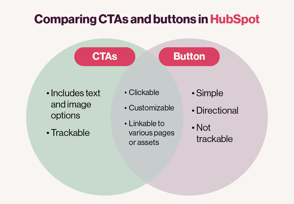
In HubSpot, you’ll find two seemingly similar but different clickable icons: CTAs and buttons.
The difference between the two lies in intent and trackability. While they basically do the same thing by guiding a viewer to a desired location or action, a CTA is trackable, whereas a button is simply there to guide.
Think of it like this: if you’re creating an email workflow or a special landing page and would like to track its effectiveness, then a CTA is your best bet. If you’d just like to point someone in the right direction, then a button will suffice.
How to create simple CTAs in HubSpot
Step 1: The design tab
You can create, update, or view existing CTAs in your HubSpot dashboard by clicking on the Marketing tab, hovering down to the Lead Capture tab, and then navigating to the CTAs tab.
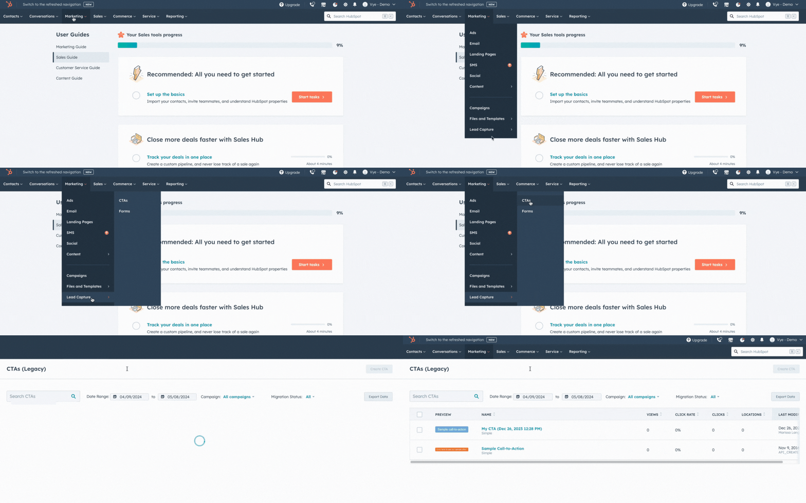
Once you’re here, look for the Create CTA button in the top right corner. Clicking this will bring up a dialog for the creation of a new CTA.
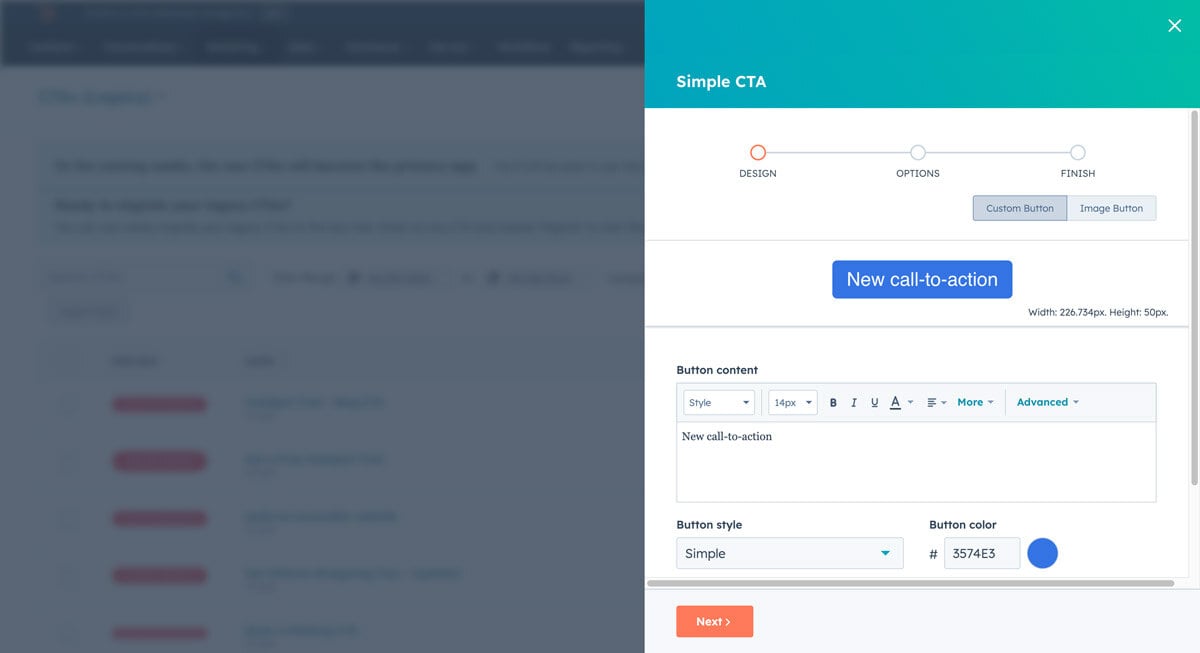
On the CTA Design page pictured above, you’ll find there are two types of CTAs you can create: Custom Buttons and Image Buttons. For now, let’s focus on the Custom Buttons.
Start by entering the engaging copy of choice in the button content box. Here’s where you’ll be able to update font styles, sizes, formatting, and more. You can also adjust the type of button you’d like to feature and its color.
Step 2: The options tab
After you’ve created the foundation for your new CTA, the next step is to complete the Options tab.
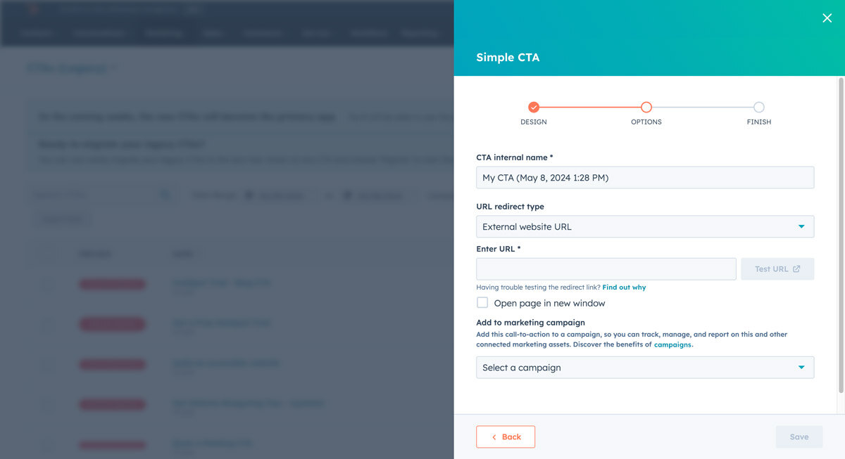
Here is where you’ll be able to determine your CTAs’ internal name, the URL redirect type, and the destination. Hubspot offers a multitude of options for destinations, including internal and external URLs, files, email addresses, and phone numbers.
You’ll also want to do on this tab is select the campaign you’d like to assign the CTA to. This is extremely helpful when reviewing performance metrics for your desired campaign.
Once everything is complete, simply click the Save button to finalize your new CTA!
How to create image CTAs in HubSpot
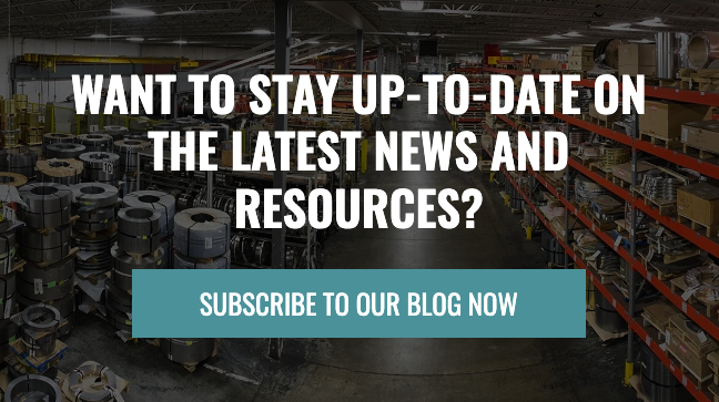
Step 1: The design tab
Creating an image CTA in HubSpot is almost as easy as creating a simple text CTA. Start by using the same Marketing tab > Lead Capture tab > CTAs tab > Create CTA workflow outlined above.
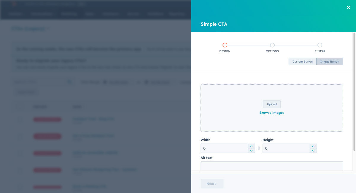
Once you arrive at the CTA creation page, you’ll obviously want to select the Image Button option this time around.
An Image Button is as expected — you upload an image, add some alt text, and that’s pretty much it.
Step 2: The options tab
The Options tab here is the same as the one in our previous example. Determine your CTAs’ internal name, the URL redirect type, and the destination. Then assign it a campaign, click save, and viola — you now have a visually stunning image CTA in HubSpot.
CTA best practices
Of course, all that effort would be wasted if your CTAs fail to follow HubSpot’s best practices. Here are some things to note while you create your call-to-action buttons:
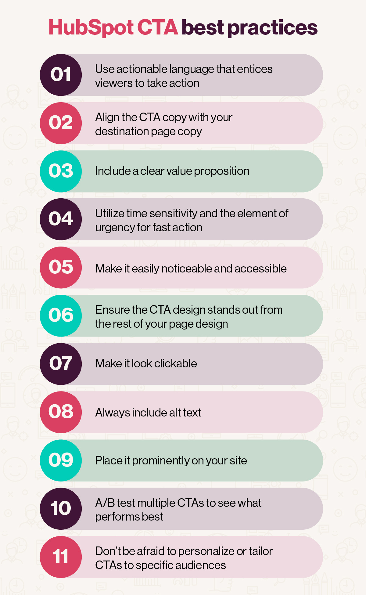
There you have it! The HubSpot CTA world is your oyster. Now, go out there and push the envelope!
Get a free HubSpot demo and unleash your marketing potential
HubSpot is a comprehensive customer management system that helps companies align all areas of their marketing, sales, and service efforts. Vye is a HubSpot partner agency with talented marketing gurus who can help you align the CMS with our business.
Combine the two, and the sky is the limit.
Sign up for one of our free HubSpot demos and find out how to:
- Get more traffic with SEO, social media, and blogging tools
- Get more leads with landing pages, calls-to-action, and form-building tools
- Get more customers with email, marketing automation, and lead intelligence tools

