When we say extreme, we mean it in the best possible way — a website design change that exceeded the needs of our client, Audio Video Extremes (AVX) — a company pushing the envelope for every audiophile, every smart home fanatic, and every business protecting its assets; you name it. We cranked the volume way up, amplified the entire website experience, and brought home security to the big screen. Here's how the AVX brand got louder, bolder, and even easier to find in the busy world of tech.
Meet the AVX Extreme-praneurS
Any good business begins with a dream. Even better brands begin with passion, sweat equity, and good, old-fashioned fear.
Rich and Jodi Erkens opened their doors in Central Minnesota back in 2005. This was pre-Great Recession of 2008. Dreams were easy and betting on small business seemed like the best idea for Rich who had spent his entire life working in the audio and visual atmosphere. Ask him how it all started and he can't even really tell you because it's always been ingrained in him.
Fresh Tech
Since 2005, the AVX squad has been on a mission to provide customers with their dream technology even if they can't articulate what that means, until they meet the team at AVX. They believe there’s nothing too extreme for your home, vehicle, boat, A/V, commercial residence, or anywhere else that could use a revamp — whether that’s to improve security or to deck out living spaces. No matter the project scope, AVX understands the unique needs of their clients and has this beautiful way of making something so sterile and commonplace seem warm, human, and necessary for homes and businesses alike.
A lot has changed since their business launched, too. The technology industry is completely different now than it was back in 2005; people want and expect more and the demand for fresh tech never waivers. Today, AVX handles more and more security and surveillance systems; who would have thought that’s where the tech would take them? Being nimble and pivoting to meet the needs of customers has always been the primary goal of Rich, Jodi, and team at AVX. How could the brand's online presence match the showroom's ability to be nimble and pivot where users were concerned?
AVX directly correlates the growth and evolution of their business with the growth and evolution of people and their lifestyles. Demand changes. People change. On top of a greater need for security, people are also looking for a different shopping experience. In 2005, customers relied on traditional marketing, if any, to help gauge their needs and present options for audio and visual services and products. It's entirely possible the phone book was a sought after resource as people searched for companies 14 years ago. Think of how anti-tech that seems now but at the time made perfect sense to the consumer.
Gimme a Hi-Fi for Inbound Marketing
It's 2019.
The world of marketing no longer just means cold calling. People are informed about products and services now more than ever before sometimes without even realizing it. You can’t get away with only using traditional marketing methods anymore or relying on a website static in nature praying that phone rings. Sure, they are still crucial aspects of a company’s success, but they aren’t the whole picture. The whole picture should now be in mega resolution.
Today more than ever, people want an experience; they crave a personal connection with the businesses they associate themselves with and fork over their hard-earned money to. The hard sell just scares them away and is quite frankly, outdated. Customers are looking to be nurtured in every stage of their Buyer’s Journey — awareness, consideration, and decision.
There's even the delight phase that appeals to consumers across every industry. AVX needed a fresher inbound approach to their website — one that made it easier for customers to navigate and digest the content, plus it had to be one that matched the products and services offered. AVX's showroom is an awe-inspiring experience that's part theatrical, part massive tech, part simplistic, realism for consumers to soak up and envision as their own. The website needed to echo that experience; goosebump-inducing would be a sub-goal.
Wait. Goosebumps?
Yes. Sit in AVX's showroom speaker room. Close the door. Wait for Rich to queue up your favorite song via Deezer so the audio is rich and uncompressed just like the gods of audio intended. Feel the warm anticipation of sound and your body's movement alike. Hear the very first chord pierce through the silence from the Focal speakers, imported from France. Feel memory and nostalgia flood your heart and brain simultaneously as you automatically mouth each lyric. You will instantly remember scents associated with listening to that song with the people and in the places you loved.
That's how our relationship with AVX started. The biggest component of client-agency relationships is mutuality; we connected early (and loudly) on the what, how, and why behind their brand and understood the challenges they had reaching customers with an outdated website lacking clear conversion paths for today's savvy consumer.
How does that translate to content marketing? See how the AVX brand set about accomplishing that feat for its online customers in the video:
The Challenge: Goosebump Factory
AVX was looking for new ways to grow their audience and build their brand awareness. They were at a point where simply having a physical site just wasn’t enough. AVX wanted to create engaging content with their own unique voice on their website; they wanted to share their story by adding their good ol’ AVX family touch while persuading those goosebumps to emerge.

AVX knows they have the product; they have the service. Their old design just wasn’t providing the results they were looking for. Their main focus is on smart home technology, and their old site didn’t portray that. You know what they say, “out with the old and in with the new.” How could we help them recreate their bold, loud brand story through online efforts?
If It's Not Simple, You Won't Use It
Rich said that in our discovery meeting we held between our two teams. "If it's not simple, you won't use it." He, of course, was referring to technology but that statement and intent transcends the A/V world and also appeals directly to website design and development. Think of it from a UX standpoint. Make it simple, make it stand out. That became our inherent goal one both parties wholeheartedly agreed upon. If AVX is the album; Leighton Interactive is the liner notes.
The previous AVX website lacked clarity or any real motivating direction for what the user should do. The header had conflicting calls-to-action: Visit Our Showroom? Or call the Waite Park location? Or call the Fargo location? The images were gorgeous but also confusing which means the beauty did nothing and was a clear distraction for UX. Was AVX selling patio furniture? Lighting fixtures? Fireplaces?
Further, the header area took up valuable real estate, which forced users to scroll to see any actual content. Plus, the content was all about AVX — not about helping their customers or acknowledging their presence as visitors. Nobody cares that they provide high-quality audio and video services, or that their expertise is unmatched; those are the two most overused statements in all of consumerism and because of it, both are implied regardless of industry. We have good stuff and we are good at selling it. Correct. That's why you're in business in the first place. Users want to know how AVX can make their lives better, louder, safer, and more convenient.
The new website solved those problems while managing to make them look like the high-end audio/video company they are.
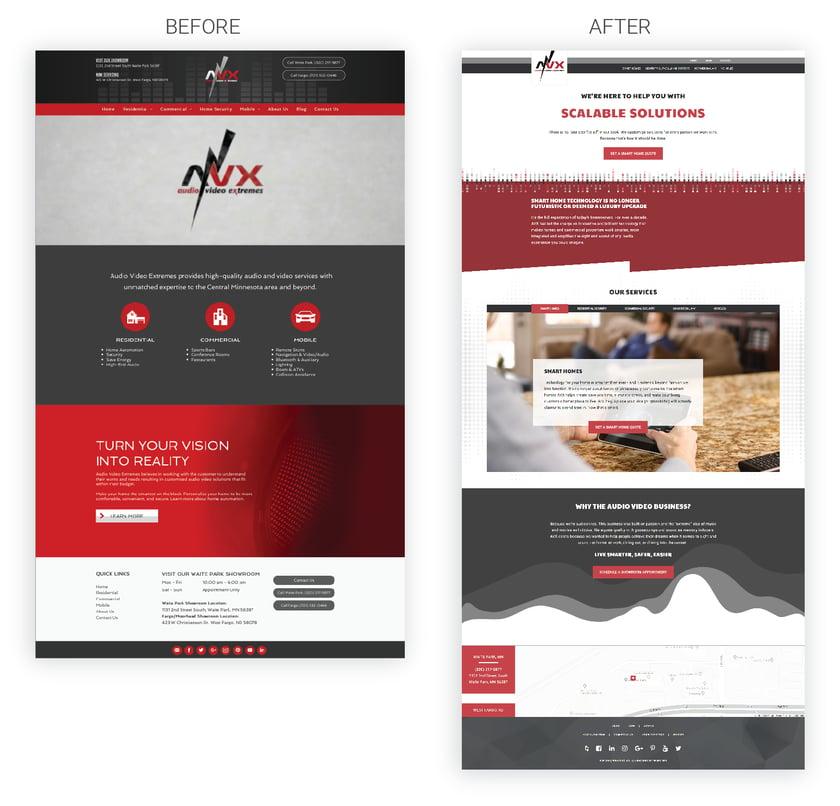
Look at that hero section! We are here to help you with ... and it scrolls to offer a wide array of services. Right off the bat users will know AVX is in the service industry and the business of helping, solving, listening, and connecting. The refreshed version of their website puts their mission statement front and center: We’re here to help with your Audio/Video Dreams. It also only offers one CTA, which is their main focus area of Smart Homes.
Only after scrolling through the website are users presented with information about AVX’s expertise and tenure in the A/V world. And it’s not chock-full of cheesy cliches. The copy is well-written and engaging, which plays into why the website engagement metrics improved across the board. Once you meet Rich, Jodi, and team at AVX, you'll see why coaxing that tone and brand voice over into their site and content marketing is so important to the overall experience. They're not selling anything; they're saying they can help with everything.
The Day the Music Did Not Die: Results
The new Audio Video Extremes website launched on September, 28th, 2018. A day that shall forever live in rock 'n' roll (and marketing) infamy! Since that date, compared to the previous period, every single metric has improved significantly:

These are not just minor improvements, either.
For example, users are now spending over 200 percent longer on the website than before. Up to nearly 1:30, from less than 0:30 seconds in the previous period. The benchmark for the average session duration is longer than 59 seconds because users need at least a minute to consume most pages and to determine if they want to continue through the website. Looking at the improved Pages per Session metric, it becomes clear that the new website does a much better job of engaging users. They’re now visiting more than two pages on average, compared to the barely more than one page on the old site.
This is further evidenced by the drastic decrease in bounce rate, which is the percentage of single-page visits. The old site had nearly a 90 percent bounce rate, meaning that 9 out of every 10 users left the site without visiting a second page. The new site has less than a 60 percent bounce rate.
If You Blare It, They Will Come
The old site received a majority of its traffic (31 percent) via direct traffic, which is users manually going to the website in their browser:
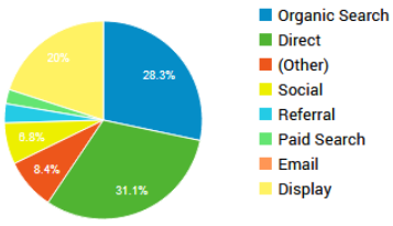
The old site was not well optimized for SEO, which is arguably the single most important traffic source. Organic Search provides a passive flow of continual traffic to a website — assuming it is well-optimized.
The new website flipped this around, with nearly 50 percent of all users coming from organic search. Those are users looking for the products and services that AVX carries — that’s some extreme high-quality traffic!
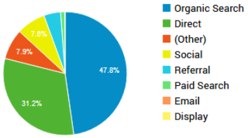
Looking at just organic search, we see a similar trend where every single metric is up by large margins:

Further, looking at the number of organic keywords the site ranks for, we see a massive jump right after the new site was launched last year. It went from ranking under 200 keywords to well over 600 in the course of one month. Just look at that difference below:
 Yes, organic keywords are crucial. This change is impressive, but the true test of a website’s success is in the number of leads it generates — turning prospects into customers. After all, they are a business.
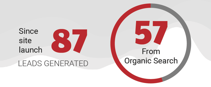
We don’t know what the old site was generating, but since launching the new site, 87 leads were created with 57 of them originating from Organic Search:
 So what do you think? We’d say these are some stellar improvements made to AVX’s website — and they directly reflect their commitment to growth and innovation. And their passion to strive for better is one of many reasons why we love our partnership with them. Their massaging theater chairs and fresh showroom popcorn don't hurt, either!
That Sounds About Right
AVX’s work is all about relational — never transactional. They take great pride in being invited into people’s most treasured places to enhance their living experiences. And that caught our eye. Who heard that loud and clear. They care about people — so do we. AVX’s customer-focused, honest approach to conducting business is inspiring; working with their exceptional family has continued to push our Leighton Interactive Transparent Tribe to continue to hold true to our own values. Our family is humbled and thrilled to work with such a true client who is always striving for excellence.
Also … did you get a chance to see the impact video yet? If not, check it out below!
