Vye Brings Home Hardware at this Year’s American Advertising Awards
Vye, a growth marketing agency with offices in St. Cloud, MN and Green Bay, WI, took home 11 American Advertising Awards (AAA) during the recent virtual awards event hosted by AAFCM.
Judge's Choice
Vye Brand
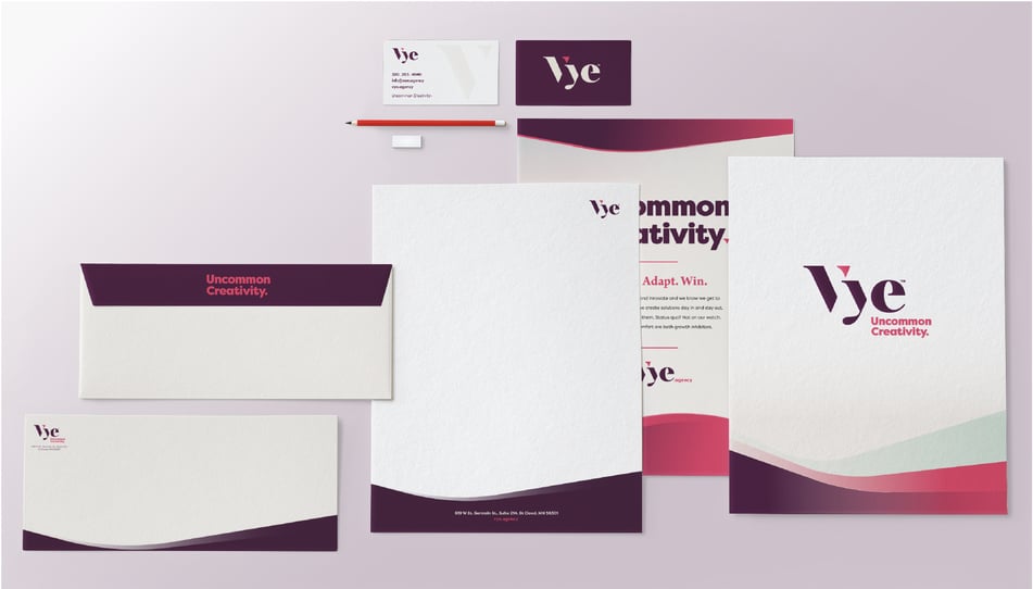
After 10 years in business as Leighton Interactive, and in the middle of a pandemic, our agency sought out to redefine our business. As a result, Vye was born. The shift from Leighton Interactive to Vye is more than a rebrand. Vye represents a complete investment and refined focus on the agency’s mission to “redefine marketing as a measurable growth investment." With this in mind, we crafted an entirely new brand identity including name and logo, a vibrant and original color scheme and a friendly, authoritative editorial tone. We captured the essence of our new tagline, Uncommon Creativity, through photography and graphical treatment. The Vye brand better reflects the caliber of clients we partner with, and showcases a contemporary approach to measurable marketing.
Learn more about our rebrand thought process here.
Gold Awards
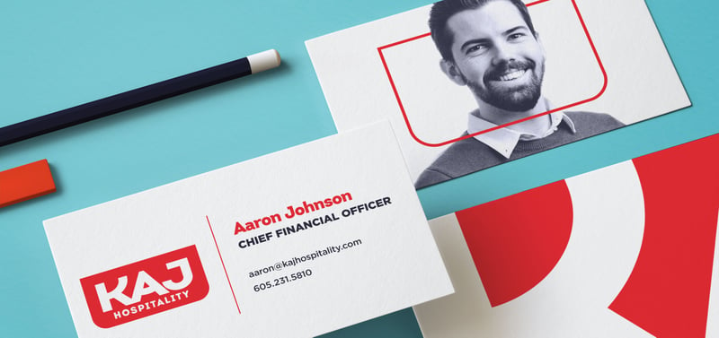
Who’s your hero? In our work with KAJ, it didn’t take long to uncover that the employees are the everyday heroes behind a first-rate hospitality experience. Here for People is the connector of the company’s values, purpose, and bottom line (and also their tagline; a great springboard for all marketing and communications). We helped bring this to life with a full identity package and brand guide, a messaging strategy, and more importantly, an internal rally that the people of KAJ can call their own.
Learn more about KAJ here.
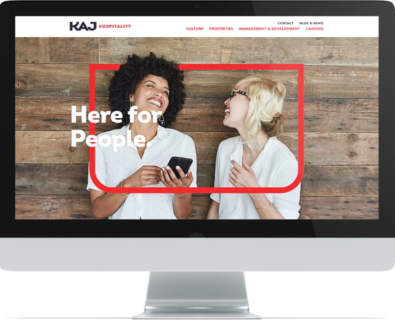
Crafting the KAJ Hospitality website was our first opportunity to implement the new brand. We knew the digital experience would be critical, especially as their primary goal—recruitment—was mostly conducted online. KAJ is a people-centric organization on a mission to regard people above all else, whether that be customers or employees. We wanted the website to reflect that. With an emphasis on joyful people, paired with bold and bright colors, the website offers an uplifting experience and elevation of the hospitality industry.
See the website here.
United Way ‘Raise Your Hand’ Campaign
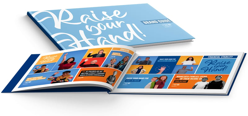
United Way of Central MN is facing a challenge: their primary source of fundraising—workplace giving campaigns—has been steadily declining, and the pandemic didn't help. The traditional method of fundraising through workplace engagement doesn't resonate with a younger audience. United Way of Central MN partnered with Vye to solve this challenge. How can we engage the Millennial and Gen Z audiences in a way that inspired investment, whether that be time, money, or advocacy? The 'Raise Your Hand' campaign in a multifaceted effort to attract attention and inspire action. This campaign involved a multitude of integrated efforts including video, website content, social media promotion, paid promotion, and email nurturing. The campaign balanced United Way Global brand standards with a unique flare that reflects the Central MN organization.
See the video series here.
Silver Awards
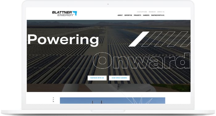
Vision takes energy, and for more than 100 years, Blattner Energy has brought their vision to life within an industry that never stands still. With continuous improvement and innovation in mind, Blattner was vying for a way to better showcase their expertise and experience through a revitalized website featuring the people behind their success. We helped them fulfill this vision with energetic design elements, vivid imagery, and a newly implemented messaging framework centered around the concept of ‘Powering Forward’. While beautiful, the website is much more than a collection of visuals. It was designed to attract and convert prospective employees and customers alike. Every aspect was specifically designed to lead a user through their digital journey, with the ultimate goal of connecting them to the Blattner team.
See the website here.
Marco ‘Don’t Limit Linda’ Campaign
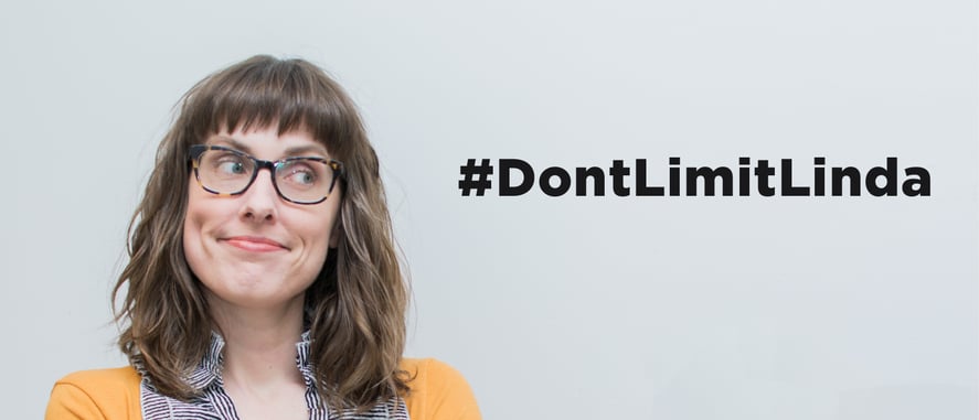
As a technology company, Marco has struggled to tell its story and talk about its products and services in a way that is light-hearted and relatable. Technology changes and evolves faster than other industries, and for those with technical careers or mindsets, that can be really exciting. But it’s much more difficult for Marco to speak to individuals who are less technical. Tackling that challenge led us to a creative approach revolving around a set of videos with a single tagline: Don’t Limit Linda. Linda represented all the humans out there who get "stuck" with things that fall decidedly outside their job description. Linda is the one who has to fix the printer jam. Linda has to figure out why the Wi-Fi is down. Linda is the office hero. But Linda needs help, and that’s where Marco comes in. This series of videos playfully depicts some of these comical scenarios, and positions itself as a guide that can help the Linda’s of the world succeed.
See full video series here.
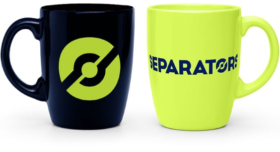 Separators was vying to elevate their brand to match the caliber of customer they were hoping to work with. In an industry that tends to be somewhat antiquated, Separators was ready to make the leap and create a brand that truly stood out from competitors. The result was a bold, contemporary approach to the logo, brand graphics, and messaging. We gave the Separators brand an adrenaline shot by using an electrifying green color. The logomark has also become a substantial aspect to their brand, as it is woven throughout their digital and print materials.
Learn more about Separators here.
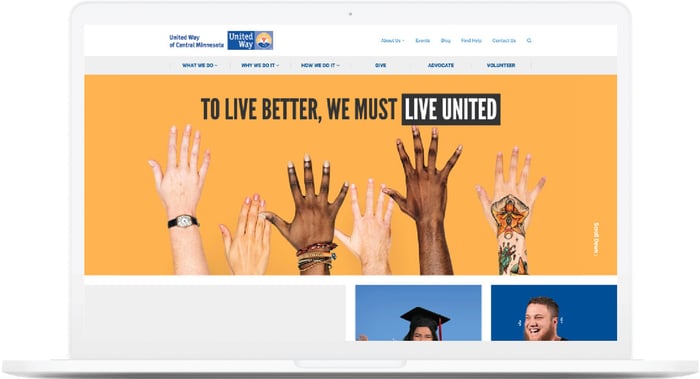
Eager for a new way to engage specific demographics, United Way of Central Minnesota approached our agency with a desire to better understand its target audiences. Based on our persona research, we built a website that included meaningful content to reach target audiences. The website redesign project was done with the intention of generating brand awareness for United Way of Central Minnesota with local residents. Additionally, the website was crafted to influence the number of donations and event involvement among pre-retirees/retirees and young professionals. While the website utilizes United Way Global brand standards, it also exemplifies specific design attributes unique to the Central MN organization. The design emphasizes people, bold and bright colors, and uplifting, actionable statements.
See the website here.
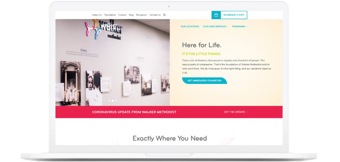
As a provider of senior living options, Walker Methodist went through an understandably crazy year in 2020. Through the chaos, Walker Methodist knew it needed to improve the user and brand experience of the website in order to best serve current and prospective residents and families. This commitment to excellence led to a partnership with Vye. We were able to help elevate the Walker Methodist brand by reimagining its brand experience. By softening the color scheme, incorporating beautiful imagery and video content, and focusing on uplifting messaging, we were able to bring Walker Methodist experience to the life on screen.
See the website here.
Vye Brand
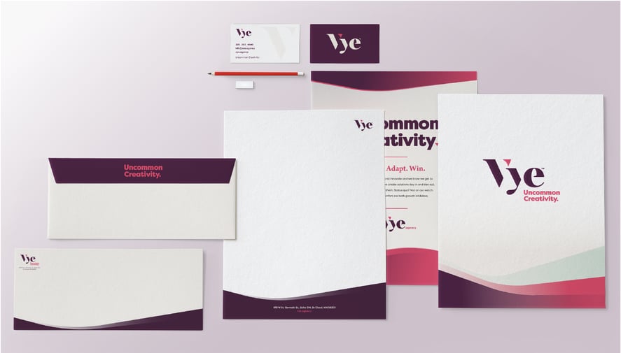
Background and creation philosophy noted above under Judge's Choice.
Vye Website
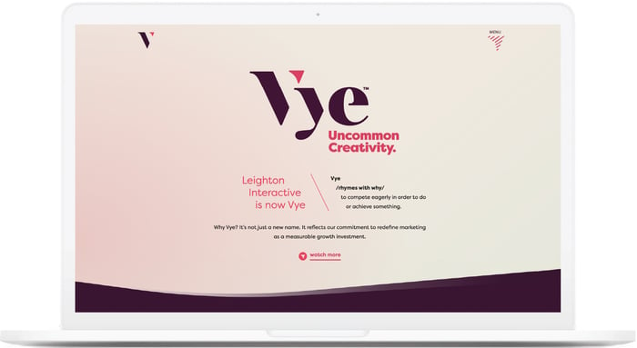
With a new brand comes great storytelling responsibility. While we are a full-service agency, our roots are in digital marketing. We knew our online presence would be one of the most impactful avenues to tell our brand story. The Vye website was designed to express our creative approach to work, while offering definitive paths for our target audiences to convert online.
Silver Medal Award
Also celebrated at this year’s American Advertising Awards, was Vye’s own Alison Schroeder. Our resident content junkie and coffee connoisseur joins fellow marketing greats as the 2021 Silver Medal Award winner. Read more about her accomplishment.
About the American Advertising Federation, Central MN.
The American Advertising Federation of Central Minnesota is one of 200 local member advertising clubs that offers the chance to participate in the American Advertising Awards (AAA) competition. The annual awards show celebrates the artistic and video work created by the Central Minnesota community.
Learn more about the American Advertising Federation of Central MN here.
. . . . .
Media Contact
Mary Rhode, Vye
mary@vye.agency
