Once upon a time, we hired a web developer named Scott Sandbakken.
And then Scott built some very cool stuff for some very happy inbound marketing clients.
And we all marketed happily ever after,
The end.
That’s how I would tell this particular story if I had to from Scott’s POV. While most of us revel in his development skills day in and day out, I can say on behalf of this entire team, we don’t actually know what he does, nor do we ever want to try to communicate it step by step.
Until now. I asked Scott to write a blog about a recent process he underwent for a complex client project and he reminded me he’s not a writer. But, he’d be willing to share it with me. So … here goes nothing.
Please be kind to this right brain of mine while it explains total left brain stuff.
Inbound Marketing is About the User
One of the first steps we take with new clients is to review current website structure and any proprietary tools or plug-ins they might have. We worked with the team at Geringhoff, a German-based agriculture company with its American manufacturing headquarters in St. Cloud, in the same manner. At the time of their website overhaul, they had a “Build a Head” tool that enabled users to do just that – build a custom combine header based on crop specifications and combine manufacturer. From there, potential customers could build the corn (or other crop) header to their exacting specifications, print it, and find a dealer to bring it to life.
The problem with the tool was its lack of intuition and outdated properties that didn’t match the user of today’s online profile. Geringhoff placed a big emphasis on a revamped Build a Head tool that would help users come to their own conclusions about the implement equipment they were looking for. Scott was tasked with creating a better Build a Head tool as part of the website strategy. Here’s how that went down.
There’s Logic, Then There’s Dev Logic
“Headers are complicated,” Scott told me when I asked him what his first step was. In order to build a tool that would be accurate and responsive, he had to nail down the logic. What that means to people like you and I is he had to map the user inputs – a time-consuming process of detailing every possible combination a user could potentially take within the tool to make sure it would be included in the final output.
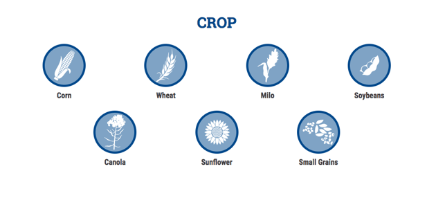
The first step is to determine crop - Geringhoff’s existing Build a Head tool had users choosing the combine first which Scott explained was inaccurate.

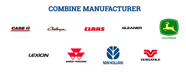
Then the combine manufacturer:

Once the manufacturer is selected, a “combine model” field is populated. Then, the user is asked to pick the width of the rows within the crop. Finally, the header is generated and with it, a nice bulleted list of must-know details for the user including header specifications, standard accessories, optional accessories, and a Find a Dealer CTA for the next step.
Scott used trusty Microsoft Excel because it did the math for him, and offered an organized way to contain that much data and all its possible variances. I asked him if it was like an exponential value-type situation – like, if I’m at a coffee shop, how many different kinds of lattes can I get if I know the number of different syrups? He gave me a “sort of” in response. Okay, I was getting closer.
Excel also granted Scott the necessary user testing for differing inputs – so if the user wanted to explore options for very minimal (yet very different) options on the head, he could do so without losing the original functionality. There didn’t have to be a clearing out or starting over point, which ultimately frustrates the user.
Testing, Testing, 1, 2, 3 …
Between the walls of Leighton Interactive (and further than that out into the realm of inbound marketing), there’s often a debate of form versus function. By example, as a writer and manager of the content process, I want everything to look and sound brilliant. From Scott’s area of expertise, it has to work. Okay, there’s not really debate. We know websites built for the optimal inbound experience have to be pretty and powerful. Geringhoff’s Build a Head was no exception.
Once the logic was nailed down, it was time for the interface to be built using JavaScript/HTML. Scott played around with different functionality. Do the users want radio buttons or a drop down menu? Do graphics matter? What happens if a user gets a little too click-heavy? How badly could the tool be broken – if it even could? The Development team has the fortunate (unfortunate perhaps?) job of seeing how user-friendly and how indestructible website tools simultaneously can be. They have to possess a keen eye for weaknesses or tendencies for fault in any application they build so as to protect the user from any of those experiences.
Once testing was complete and the Geringhoff new and improved Build a Head tool was deemed bulletproof, Scott added one more step in the value chain. He pulled in real time data connected to the company’s available inventory where prior; the lists were static, not tied to a database. This way, headers could be added or removed without touching the code.
Team Takeaways
I asked Scott for his final take on a project that spanned a pretty decent chunk of his time. For one, he mentioned knowing more about corn headers than he ever thought possible, and just how many options are available. He talked about weaving the tool through the inbound methodology and how crucial it is for his team to think about the user through every stage. HubSpot is a necessary part of the Build a Head functionality as well and is pinged each time a user submits a query, the data is captured and sent to the right dealer so it’s on hand for the next step of the methodology – sales.
