Here it is. The email you worked so hard to craft is ready to come in for a landing. This post will move away from the email itself and onto the subsequent
Let’s do a quick recap of the series. This is the final installment of a four-part series about email marketing best practices. Here’s a rundown of each post so far:
- Capture – you’ll need email addresses and associated contact information so you can segment your mailing lists. Read it here.
- Open – this step is all about ways to improve your open rates. Read it here.
- Click – now that your email has been opened, you need the recipient to click. Read it here.
- Convert – the final step is optimizing your landing page so users convert. (That’s this one!)
There’s an important term that applies to the concepts outlined below. I’ve used it before, but in this final step of optimizing landing page conversion, it’s more important than ever. That term is continuity. According to Google’s Knowledge Card:
Continuity is “the unbroken and consistent existence or operation of something over a period of time.”
Or, more simply, consistency through multiple steps. Essentially, everything you’re saying in your email should follow-through to the landing page. Here are some tips to do just that.
Be Clear and Specific
The headline of a landing page is the first thing a user will see, so it should be immediately clear what’s being offered on the page. The headline should clearly state the value proposition (goal) of the page and the opening paragraph should reinforce it with supporting copy.
Oftentimes, companies will try to get sugary and creative with headlines and put the actual value proposition as the first line in the opening paragraph. Try swapping your headline and opening sentence and see what happens.
Bullet points are your friend, and so are short paragraphs. As with email copy, the best way to improve landing page copy is with a pair of scissors.
Address Concerns
Remember from my previous post in the series that users don’t trust you? Just because they clicked your email doesn’t mean they now fully trust you. It means they trust you enough to click. Not necessarily to convert. There are dozens of concerns a user may have. Here are some of the bigger ones and how you can address them head-on.
Is my information safe?
This doesn’t just apply to e-commerce and financial industries. Any site that collects user information, which is basically all websites, needs to take steps to ensure that information is safe and secure.
A link to the privacy policy is a great start. So is using an SSL certificate. This is where you’ll see https instead of
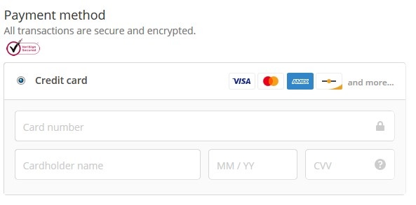
 Notice how there’s a Verisign Seal right before the form asks for credit card details? There’s also a little padlock icon in the credit card field further indicating that the information is safe and secure. Plus, there are icons for each card they accept. It may seem unassuming, but letting users know right away which providers you accept is an easy way to make a happy buyer. There’s nothing more frustrating than entering a card only to have it get declined because the site doesn’t support American Express.
Where is my money going?
This mostly applies to sites asking for donations. It’s such a big problem that there’s an entire organization dedicated to reporting on non-profit donation dollars and how they’re being spent. That’s how much distrust consumers have when donating to a charity. You can remove that concern straight away by simply stating upfront where their money is going and what it’ll be used for. Don’t hide it. Lead with it.
“75 Percent of Donations Are Invested in Our Programs.”
“Ninety Cents of Each Dollar You Donate Will Help Feed a Child.”
How reliable are you?
Remember, users still don’t trust you. The landing page is your last chance to tip the scale of trust with them. A great way to do this is with customer testimonials or product reviews. Don’t go over-the-top, though. One testimonial is fine on a landing page. Just enough to ease any lingering concerns.
If your company has certifications from industry organizations, use those badges or seals on the landing page.
Is this product or service a good value?
It’s true that you get what you pay for – but people hate being ripped off even more. Or worse, feeling like they’re getting scammed. Offering low-price or money back guarantees are easy ways to eliminate the price concern.
It isn’t always about the lowest price. There’s an element of value at play, too. You get what you pay for applies here – as long as you can prove why your product or service is worth more than the others. This is another great way to utilize testimonials and/or reviews on your landing page.
Eliminate All Distractions
If the goal of an email is to earn a click, then the goal of a landing page is to earn a conversion. One of the best ways to do that is to eliminate any element on the page that doesn’t either state or
It can be easy to go overboard on a landing page trying to address every concern, area of friction, or anxiety a user may encounter. Resist the urge to throw-up everything you have on your landing page. A cluttered mess won’t do you any good.
Landing Page Design
Having (or hiring) a designer with experience creating conversion-oriented landing pages is a must. There are some all-around best practices for landing page design, and I’m going to touch on a few specifically.
Button Design
I cannot stress enough the importance of this seemingly inconsequential design element. The button at the bottom of the form is the last line of defense for your landing page. Design it wisely. Choose the words with care. And for heaven’s sake, don’t use the word Submit. Ever. Nobody wants to submit to anything. There are better options out there:
- Get Started
- Complete Your Order
- View Options
- Browse Inventory
- Buy Now
- Learn More
- Request Information
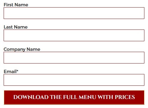
Take it a step further by customizing the button copy for your industry. Here’s how one of our catering clients did it.
The catering industry is competitive and many times it comes down to price. Keyword research taught us that users aren’t just looking for a catering menu, but a menu with prices. We addressed the price concern within the button copy itself, reassuring the user that the menu they were downloading would include prices.

Eye-Path
Most countries read from left to right, top to bottom. So, for two-column layouts, the value proposition headline should be on the top left of the page, with the button of the form on the bottom right. For single column designs, the headline and supporting copy should be first with the form at the bottom. Anything with more than two columns can quickly become a distraction and disrupt the natural path our eyes wish to follow.
Make sure to position elements intended to address visitor concerns near the area where the visitor is asked to take action. There are plenty more actions than clicking the submit button. From scrolling up or
In the credit card example from above, the Verisign seal was located immediately above the credit card input field – the area the user needs to take action.
User Choices
If you’ve ever heard of paralysis by analysis, you’ll know what I’m getting at here. Analysis paralysis is part of the social science behind decision making. It is the state of over-thinking when presented with a multitude of choices, which results in no action at all. When it comes to your landing page, the last thing you want is indecision!
There should only be one choice on a landing page: to submit the form. Anything else (like site navigation, social icons, or links within the copy) are distractions and should be removed with no remorse.
Landing Page Conversion: A live Action Example
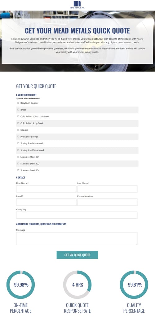
Here’s a landing page that does everything right:

Right away, the headline offers a clear value proposition: a quick quote on metal material. The paragraphs are short and provide
The form itself it as simple as it can be when asking for this type of information. The button copy re-states the action that will happen upon submission. Finally, the three stats immediately below the button (in proximity to the area of action) each address a specific concern we identified during our research process. Will my order arrive on time? How fast will you get back to me? How is the material quality?
But don’t take my word for it. The page’s performance speaks for itself. As of this writing, it boasts a 37 percent submission rate.
How’s that for landing page optimization?
