Are you sick and tired of debating over your website design? It’s just meeting after meeting – and you never seem to get anywhere. Are the changes actually working? How do you know? Although it’s a simple question to ask your web designer, it doesn’t necessarily have a simple answer.
For years, web designers, account managers, marketing directors, and sales teams alike have had endless debates on what their website should say. What’s the biggest piece of the pie? What will convert people from website visitors to customers? And even after all of those discussions, we still let our designs be dictated by our assumptions and opinions.
Our personal biases get in the way of arguably the most crucial factor to weigh in when analyzing your website for constant growth: your user.
Put Your Users First
It’s time to think differently. Perfection doesn’t exist – only best practices and guidelines. But you can’t forget to keep one thing in mind that’ll help you succeed. It’s not your CEO. It’s not your opinion or your feelings. Sorry. They still matter, of course, but they’re just not #1.
I’m talking about creating your website around your users’ experience. And not just based on what you think will work, but based on what you can back up with facts – with real data about how your site is performing. You should be able to answer questions like:
- How much organic traffic is your site seeing?
- Where are visitors spending the most time on your website?
- Is there a high bounce rate on any specific web pages? If so, why?
Collect and use this data from your users. That’s why it's there anyway, right? Analyze this data over time, too — taking a peek at it once a year won’t cut it. Note the differences in smaller time frames. Did users browse through your website more or less this past month? How about the past week?
Taking these measurements into account is what the Growth-Driven Design (GDD) process is all about – designing a website that constantly improves. And it revolves around the data your website viewers provide. Take full advantage of this opportunity to redesign your website based on data.
To get just a taste of what this conversation would look like with our team at Leighton Interactive, you can sign up for a free Data-Driven-Design-Audit for your website. You’ll receive an overall grade on your website’s performance. And, you'll get to see how users are actually interacting on your site with a report of heatmaps and recordings. After all, what’s the point of having a website if you don’t know how your users are interacting on it?
What You Get with Our Website Audit
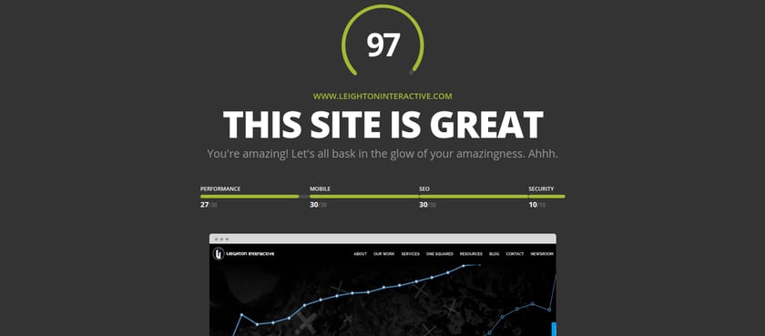
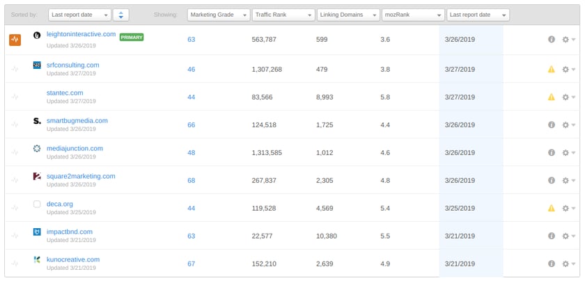
Below are some heatmap examples of how users are interacting with our Leighton Interactive homepage. Also, there is an overall grade of our website from Website Grader and a screenshot of how we rank with competitors. You’ll receive a similar data-driven package from our website audit.
Heatmap showing where your users click on your site.

Clearly, our About tab receives the most clicks — which people want to know about us, our lifestyle, and how we do what we do. Coming in at a three-way tie are the Our Work, Services, and Contact tabs.
Heatmap showing how far your users scroll down on a web page.

If you’re familiar with the Inverted Pyramid methodology, you’ll know that people tend to spend more time at the top of a webpage, blog, etc. Want to see better results? Put the important stuff at the top, front and center with clear copy.
An overall grade on your website, rating it on performance, mobile, SEO, and security.

A competitor comparison showing your marketing grade, traffic rank, MOZ rank, and more.

The information you get back from us will be free for you to use at your disposal. If you want to really dig in and bring your website game to the next level with our Growth-Driven Design (GDD) approach that solves for your users, we’re ready to talk.
