Is your website tired, run down, listless? Does it poop out at parties? Is it unpopular? The answer you all your problems is Vitameatavegamin!
Okay, just kidding. I had to throw an I Love Lucy quote in there somewhere. But seriously, do you feel like your website is lacking? Perhaps you’re getting a decent amount of visitors, but the end result – customers- isn’t reflecting that? One of the easiest ways to improve your website results is by adding Calls-To-Action on your website.
What are Calls-To-Action?
I talk about Call-To-Action buttons (CTAs) a lot. And by a lot, I mean a three-part blog series amount. If you’ve never heard about CTAs, you should definitely start by reading this blog. To put it in simple terms, though, CTAs are buttons strategically placed throughout a website to lead the users forward in their buyer’s journey. The buttons provoke an immediate response, compelling users to take action.
Why are CTA's important?
Sometimes as website visitors, we don’t always know exactly what we want. We might have a general idea of the question we are trying to answer, but that doesn’t mean we know which link to click in the navigation. By providing clear direction, you give your website users an easy path to the answer they’re looking for. You become the helpful guide, assisting your visitor in becoming educated about your product or service.
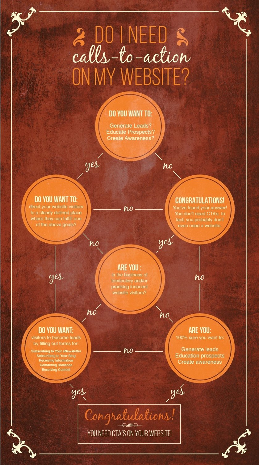
Still not sure if you need CTA's?
I made you a helpful flowchart.

“Fine. I get it. I need CTA's.“
Okay, so you’re convinced. Good. Now what?
First you’ll need to decide on what the CTA is leading the user to do. Do you offer any free resources that will help educate a potential customer? Perhaps an eBook or a guide? Maybe you simply want to make sure a user gets to a specific page- like the product details page. It all depends on what you are trying to achieve on a page.
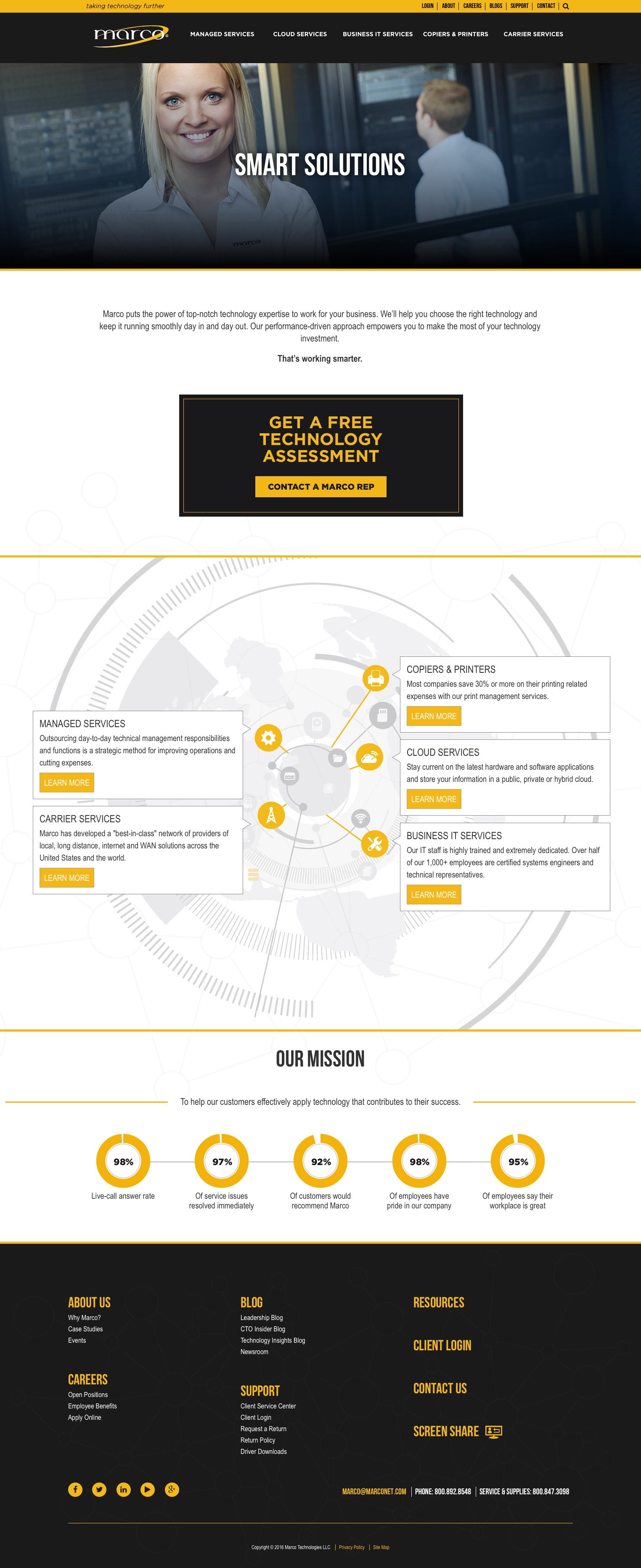
Take Marco’s homepage, for example:

Right away you see a headline, some supporting copy, and a CTA that says, “Learn How We Can Help.” Notice how actionable language was used. Learn, Read, Get, Watch, See. Words that insinuate action is needed from the user. Clicking on this CTA leads to a page about the services and products they offer.

On this page, you will notice another CTA, “Get a Free Technology Assessment, Contact a Marco Rep.” By giving the user a CTA to move forward and take the next step, you simplify the process for them. In this case, the free technology assessment CTA leads the user to a landing page, where they fill out a form with their basic information (name, email, etc) in exchange for the free assessment. After filling out the form, they become a contact in the system Marco can nurture into a potential client.
What should they look like?
CTAs should stand out on the page. Using contrasting colors is a great way to do this. If you are looking for inspiration, you should check out this HubSpot blog, or read this blog about the 5-Step Recipe For The Perfect Call-To-Action.
Getting CTA's on your website
How you create and upload your CTA's will depend on your capabilities. If you have a designer on staff, they can easily create something that matches your website and will draw a user’s eye. If you don’t have a designer, check out this free resource from HubSpot. They have 50 free editable templates in PowerPoint, with instructions on how to use them.
Uploading them to your website will depend on the platform you’re using. If you have a developer on staff, they will be able to help you out with this. If not, many platforms allow you to easily upload a JPG and link it to another page.
Still have questions?
No worries. We’re here to help! Feel free to comment below with any questions or recommendations! If you’re curious about how CTA's fit in with the Inbound Methodology, don't forget to check out this blog!

