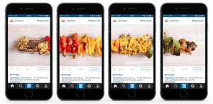
You know they’ve grabbed your attention. A few may even have made you smile. They’ve worked on you, and now you can make them work for your business. Facebook’s Carousel Ads are an excellent and fun way to promote your business. Not only do they offer the ability to link to multiple different websites in one ad, but they also lower your costs. According to Facebook, carousel ads can bring down your cost-per-conversion by 30-50% and cost-per-click by 20-30%. Compared to static sponsored Facebook posts, they’re a great way to get more bang for your buck.
Ever since carousel ads have launched, I’ve found myself going out of my way to click through them to see what type of experience they take me on. Yes, I sometimes even scroll backward because I notice one, and I want to click through it. Give your viewers something to scroll back for by following these tips.
Start With a Story
The best carousel ads that I have seen take me on a journey. Some of the formats Facebook suggests you use include:
- Highlight the features of a single product
- Explain how something works
- Offer an immersive experience by using one large image across all cards
- Use images and video to tell a story
One stellar example of a story I heard was from Project Repat – a company that turns old t-shirts into quilts. They made a carousel link ad to share with people who have received their quilts.
I’m not super into quilts, but this made me backtrack on my Facebook timeline. They didn’t need to reinvent the wheel when it comes to carousel ads. They understand that there’s nothing more important to business than your unique customers. And they portray it elegantly above.
It’s a clever idea to turn t-shirts into quilts – I never thought of it. I spent a good minute scrolling through, looking at the different images of people and their fresh new product. It intrigued me. I give this marketer an A+.
Make It Into a Picture Book
Would you rather read a 300-page novel that included pictures on every other page, or a 200-page novel that was solid copy? I don’t know about you, but a picture book sounds better to me any day. We’ve all heard the saying, “A picture is worth a thousand words”. Well, you have the ability to say 4,000 words between the four cards you can include in your ad. One example is delicious meals that’ll impress your friends.

Tesco has used this method of making a picture book many times for fun food presentation. Nothing makes my mouth water more than a picture of food, not reading about it. You want to see it first, then you’ll smell it and taste it when you make that scrumptious-looking recipe.
If your images had to tell a story on their own, without any copy, would they be able to? Your goal should be just that.
Make them Want To Jump Into the Pages
You’ve laid out your story, and have illustrated the pictures for your book. All that is left is for you to write the copy for the story that makes people wish they were a character.
The ad below is one of the first carousel ads I ever stumbled upon, and it’s still one of my favorites. I was currently in the process of shopping around for wedding invites, and I was starting to get overwhelmed with the choices. Here comes this ad, spilling diamonds into my life, telling me I can get invites for 30% off PLUS 10 free thank you cards.
This ad takes me on the journey of buying wedding stationery, makes me want to see where the diamonds are spilling off to in the next frame, and then finally makes me want to click because – hey – I want 30% off.
There are so many great ways you can use carousel ads to engage your customers, including Pinterest's newest carousel format that allows you to add up to five images in your ad. The three examples I showed above advertise completely different products, but they all engaged me so much that I decided to save screen shots of them to my phone to use as future inspiration. The sky is the limit, so have fun with them!
