The real deal
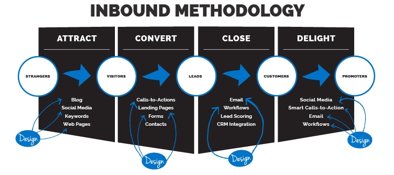
Everything is inbound, including design. If you don’t know what inbound marketing is, you should read this blog first. If you do know what it is, you might be sitting there scratching your head saying, “huh?”
When people talk about inbound marketing, they always talk about the content. They talk about the website copy, blogs, eBooks, whitepapers, slideshares, checklists, presentations, and all other forms of content. They talk about how effective it is to create content to help educate your prospect and hopefully lead them to customer status. They talk about how social media can drive people to your content, and how your sales team can take a lead that came in through the website and close the loop. But, you know what they don’t usually talk about? Design.
Everything in the world is designed
Those who know me are familiar with my belief that everything –EVERYTHING- is driven by design. Every product you buy, every public entity you support, every piece of content you consume. All of it is driven by design in some capacity. From things as obvious as billboards to as subtle as the formatting of a thesis paper, design dictates how we consume things on a daily basis.
Knowing that design pervades everything we see, it becomes easier to understand how even inbound marketing is driven by design. You can create all the content in the world, but unless there is design crafted around said content, you might never lead anyone to read it. From the way a website looks and functions to the color you use for a Call-To-Action, design play a huge role in any inbound marketing strategy. Take a look at this example. Which has a more obvious Call-To-Action? Which one better leads the viewer forward?
/CWTP-CTA1.jpg?width=640&name=CWTP-CTA1.jpg)
-OR-
/CWTP-CTA2.jpg?width=640&name=CWTP-CTA2.jpg)
By simply adding a high-contrast orange button, the direction becomes much clearer. It gives a user a better idea of where they should go, and helps attract attention.
It all starts with design
Designing for inbound marketing goes beyond Call-To-Action buttons. To create a website that acts as a 24/7 salesperson, you must incorporate the inbound methodology into every level of design. Not only does the look and feel of the website rely on design, but the functionality does as well. It is through the design phase that we decide on things that will affect the user experience. We determine the navigation, the page flow, and the responsiveness. We look at every aspect of the user’s journey through our website, and try to make it as easy as possible.

Design = Valuable content
Now, I want to talk about content. There is a misconception design doesn’t really belong in the same conversation as inbound marketing and content. I couldn’t disagree more. From infographics to videos to blog imagery, design is what entices a user to consume content. Design is what simplifies complex ideas into something that’s easy to consume. Design is the glue that holds the reader and the content together. The best part about a designed piece of content is that it can be expanded almost endlessly. Take this infographic for example (click to enlarge):

The infographic was created based on a blog that was written. After the infographic was created, we made an animated gif to use for social media sharing. We then created a small animated video using the graphics already created. All of these pieces intertwined. They all lead back to the website, therefore they all have the potential to bring in a visitor. That’s a lot of mileage to get out of a blog.

Through design, we’ve taken a simple idea about soda and we made it visually intriguing and enticing. This is the method we take with design and inbound.We provide visual content that people want to see, which in turn makes the content even more valuable. By adding dimensions to each project, we work smarter – not harder. We take a project and make it multi-faceted to get the best possible value. And that, my friends, is how you design for inbound.

