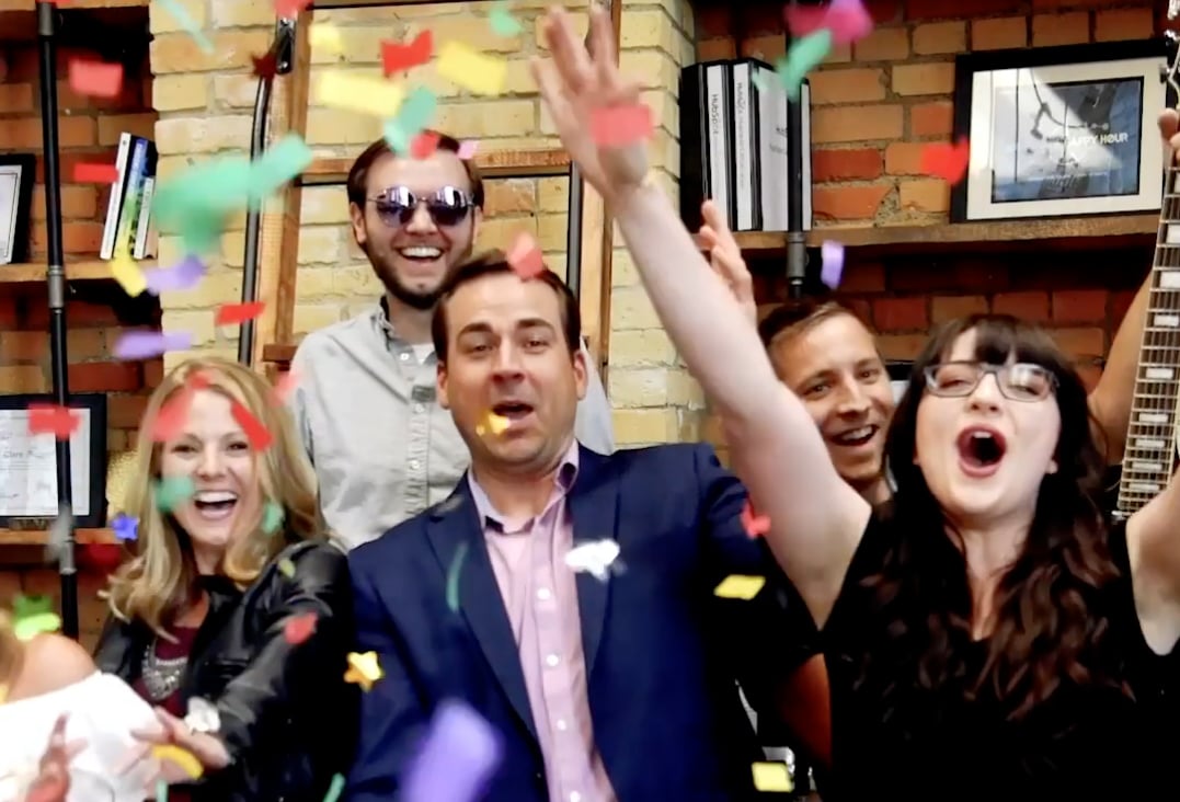
Last week, Twin Cities Business released its yearly roundup of Minnesota's best and brightest businesses.

The results from this annual subscriber survey cover everything from construction to education, and everything in-between. This year, Leighton Interactive was named the 2019 Web Development Firm Runner Up. What! Not only is this exciting, but it's a complete honor and testament of our talented team. The work we're lucky to be part of on behalf of our clients is the really good stuff. Honor. Privilege. And more!
We are both excited and hopeful of what is to come.
But before we go any further, thank you. Without you, we wouldn't be where we are.
In light of this exciting news, we couldn't help but reflect. Website development is one of our specialities, and we love every second of it. So, we had our web team reveal their favorite website development projects.
Integrations & Customization
Tony Strack, Web Development Manager
My favorite projects are typically the most recent. At LI we continue to grow and learn with each project and get better and better with new techniques, best practices, and processes. The most recent project to date is our long-time client, Marco.
This project was my first attempt at a completely modular website build giving the user full control of template creation. Rather than being restricted to specific layouts within a template, it allows a user to drag and drop custom modules around a page to create a custom layout. It consists of limited templates and instead, many custom modules. These custom modules allow a user to easily managed sections of a website while keeping those sections consistent within the design. It’s such a powerful technique for website management within HubSpot. I’m already seeing its benefits with the first build and I’m excited to see where it goes as we continue to use this approach.
Design & Dev Powerhouse
Kira Jankowski, Web Developer
My favorite project I’ve most recently worked on is Tapemark. It was my favorite for a number of reasons.
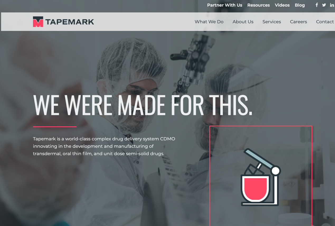
First, it was the first time I got to do web design for one of our Hubspot websites, and that was an amazing experience. Hubspot websites are so much more in-depth than some of the other website projects I’ve worked on in the past, so I got to flex my design skills a little harder on this one by designing more complex website mockups and creating custom icon sets to match their updated branding and unique business.
Second, it was a lot of fun to code as well and I really enjoyed being part of both processes. There’s so much thought that goes into the design portion of websites, and figuring out how to design a website that is both beautifully unique and functional is one of my favorite challenges. We delivered an incredible website with great functionality, custom modules, easy to edit templates for the client, and even animated icons to give the website that extra finishing touch.
Design & Aesthetic
Jashmin Nakarmi, Graphic Designer
Achieve Clean wins my top of the list. This website project is my best work, as this was the first project I was involved in from the creation of the brand to the design of the website itself.
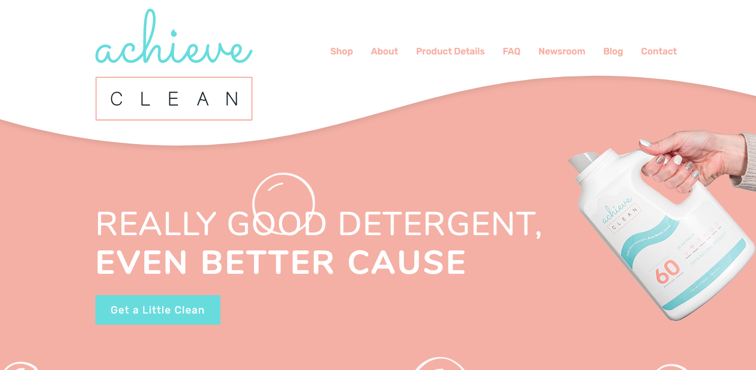
This isn’t a complex or huge site, but the mission Achieve Clean stands for makes this site even more precious to me. They provide work opportunities for adults with disabilities, and Achieve Clean particularly does this by bottling laundry detergents made in-house. From brand creation to photography, videography, and final development of the simple site, it was teamwork on this site that made it possible.
And nothing would be possible without the clients who were open to new things and loved every decision and said, "Great, this is what we needed." Hitting the mark for our clients is always a great feeling.
UX & Lead Generation
Clare Richards, Creative Services Manager
A website project we did earlier this year definitely makes it to the top of my list: Uncharted Learning.
I love this project because I feel that it truly made an impact on Uncharted Learning’s client base. Uncharted Learning is an innovative company that focuses on cultivating entrepreneurship in young people through incredible curriculum developed to educate elementary, middle school, and high school students.
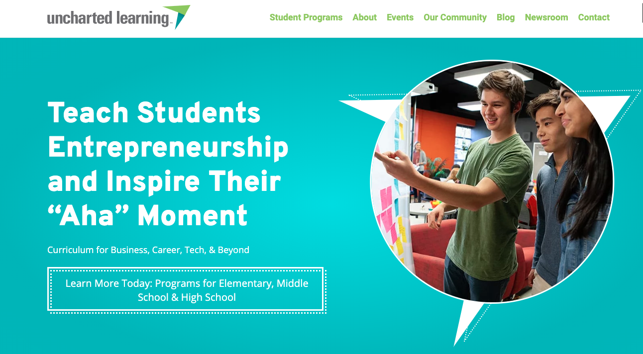
Prior to the website redesign project, their programs were split between two websites that featured the individual programs rather than leveraging the power of the parent company, Uncharted Learning. Both websites were hard to navigate and did little to educate and convert their visitors.
The new website features each distinctive program under the Uncharted Learning umbrella in a vibrant and user-friendly way that better reflects the brand as a whole. Through the process, we also incorporated distinct conversion opportunities to make it easy and convenient for users to convert on the website. Win/win!
Animations
Luke Niemela, Videographer
My favorite project we recently completed was the Tapemark website. I enjoyed this project because I was able to collaborate with Kira, the front-end developer on this project, to create custom animations. Kira designed several custom icons for the site which I then animated using Adobe After Effects.
I utilized an After Effects plugin called Bodymovin, which uses wizard magic to turn animations created in After Effects into JSON code. I'm not sure if any wizards were really involved but the plugin really saves us time when we create custom animations for websites.
It was great to see the animations come to life in the website and the added element of interactivity should help keep the user engaged while viewing the website. We have started integrating more and more custom animations for our clients and this project really helped us find an efficient way to do that.
Until Next Year
Once again, thank you. Until next year, we will continue to innovate and adapt.
